The Orange Mug Branding
Branding | Logo Design
This branding project aimed to create a brand certified as a B corporation, meaning my brand meets the high standards of a positive environmental and social impact. Because of my love for coffee, I decided to create branding for a classy coffee shop that communicates quality coffee and conveys a cozy atmosphere.
After brainstorming many names, I came up with the name “The Orange Mug” to encapsulate the warm, cozy feeling I wanted this coffee shop to evoke. The illustration I made of the orange mug would be an instantly recognizable symbol that the customer would connect with since orange mugs are used for in-shop beverage purchases.
When designing logos, my process begins with sketching out different ideas and creating iterations of various ideas, as seen above. I ultimately decided on the logo to the left and created four variations that would function across different branding elements.
The Logo


While designing the menu for The Orange Mug, I wanted it to be simple while maintaining a warm and inviting feel. I paired a handwritten typeface with a sans serif type to create a soft contrast and evoke a familiar, homemade feeling. I added a paper texture to the background for a more muted cream color and created a clear grid for the menu items. Alongside the menu, I added a second page to communicate to the customer why The Orange Mug is B Corporation certified. I matched the elements on this page to the menu so that both pages paired well together and would look cohesive sitting on a counter.
The Menu


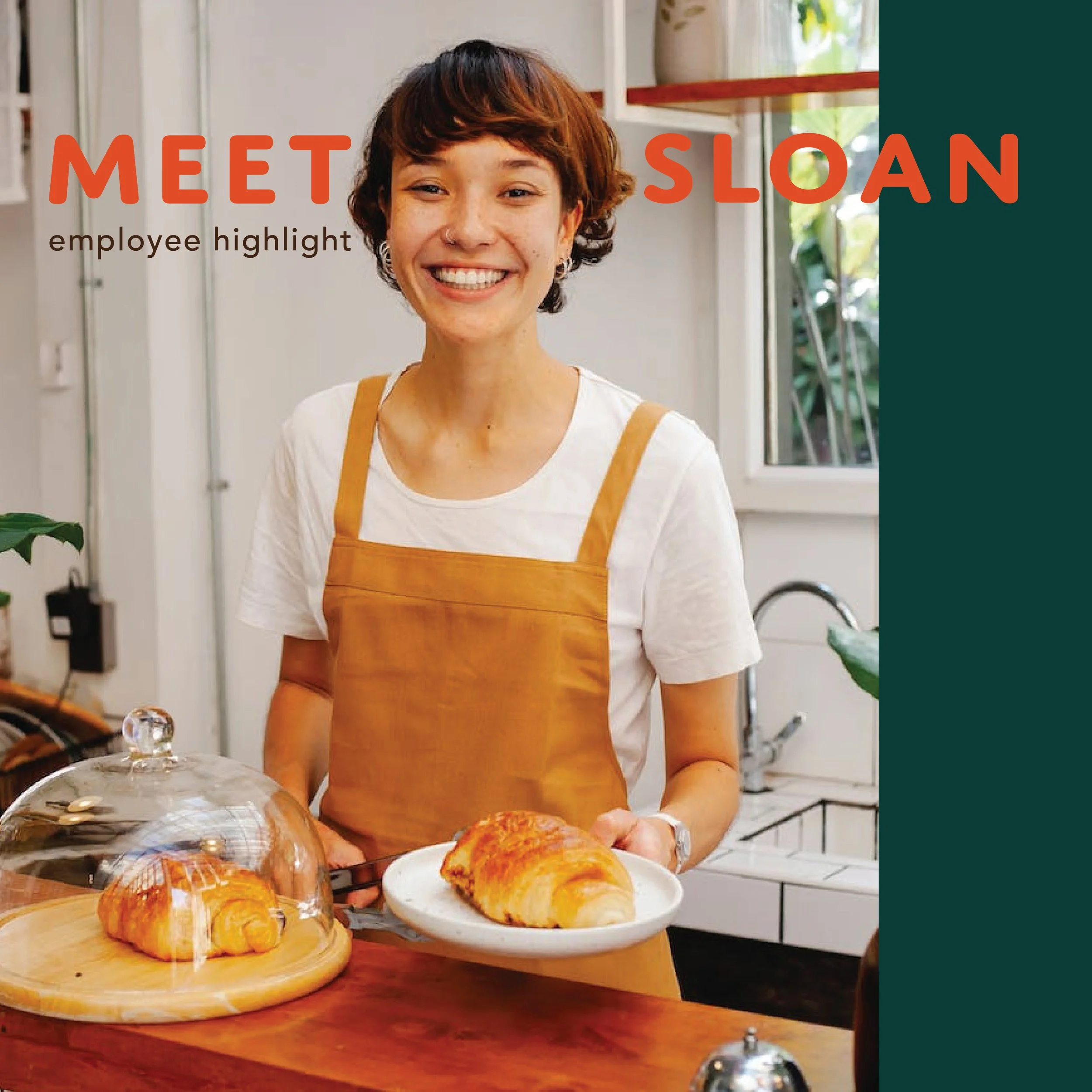
Thinking about The Orange Mug’s Instagram feed, I wanted to emphasize the orange and green brand colors to give the feed a cozy, classy feel. I chose to make two posts highlighting The Orange Mug’s social impact. I overlapped the text with the large splotches of color to provide depth within the graphic and make it visually interesting. I also thought it would be important to include an employee highlight that incorporates the brand colors while introducing the employee. The design is simple yet effective. The lower right post is an announcement for a hypothetical campaign that aims to unite the community through handwritten letters. My main focus for this design was to have a clear hierarchy in the text, which I believe I accomplished. Lastly, I included a few stand-alone images that give breathing room between the posts with text and match the theme.
Social Media Campaign