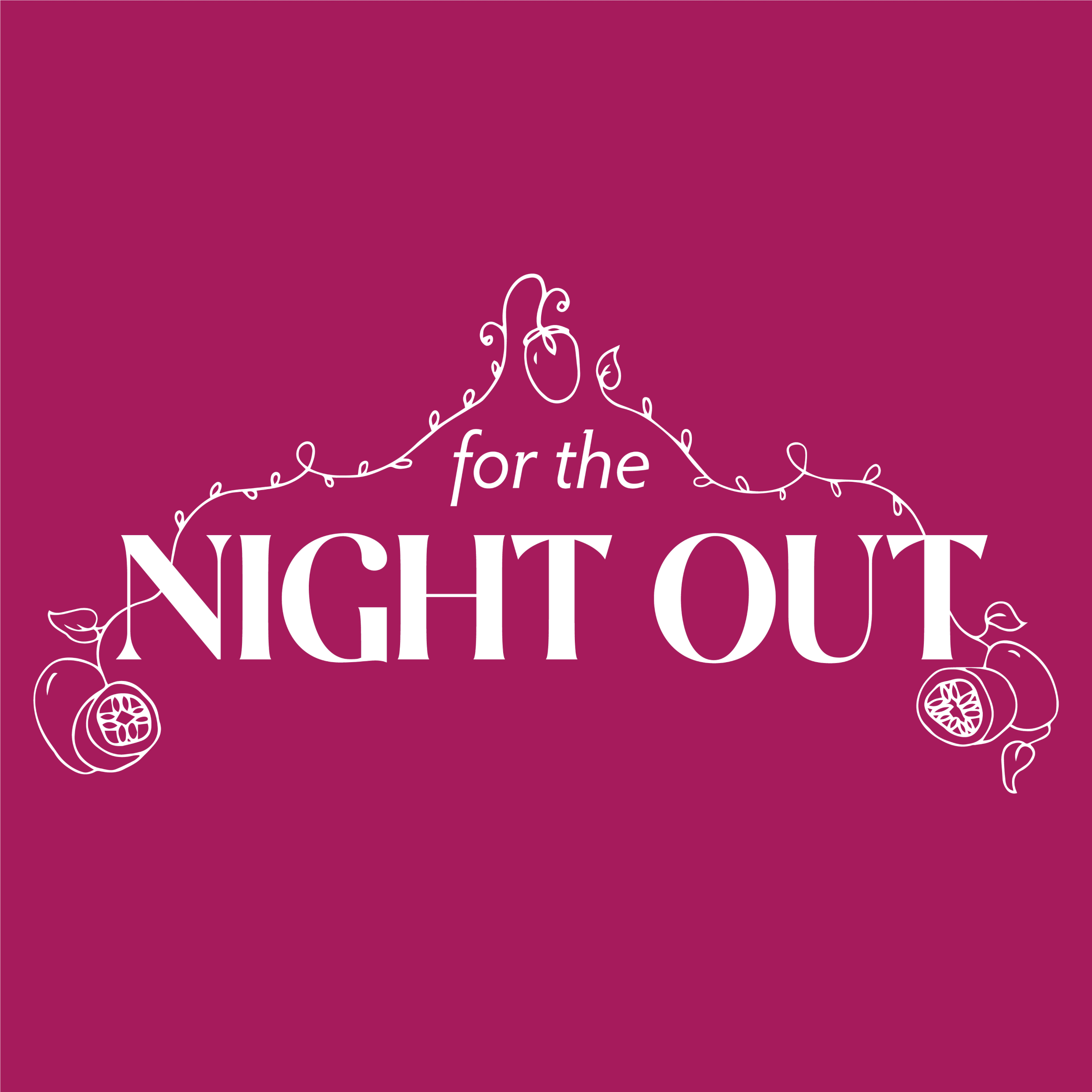
A Fun and Flirty Non-Alcoholic Beverage Brand
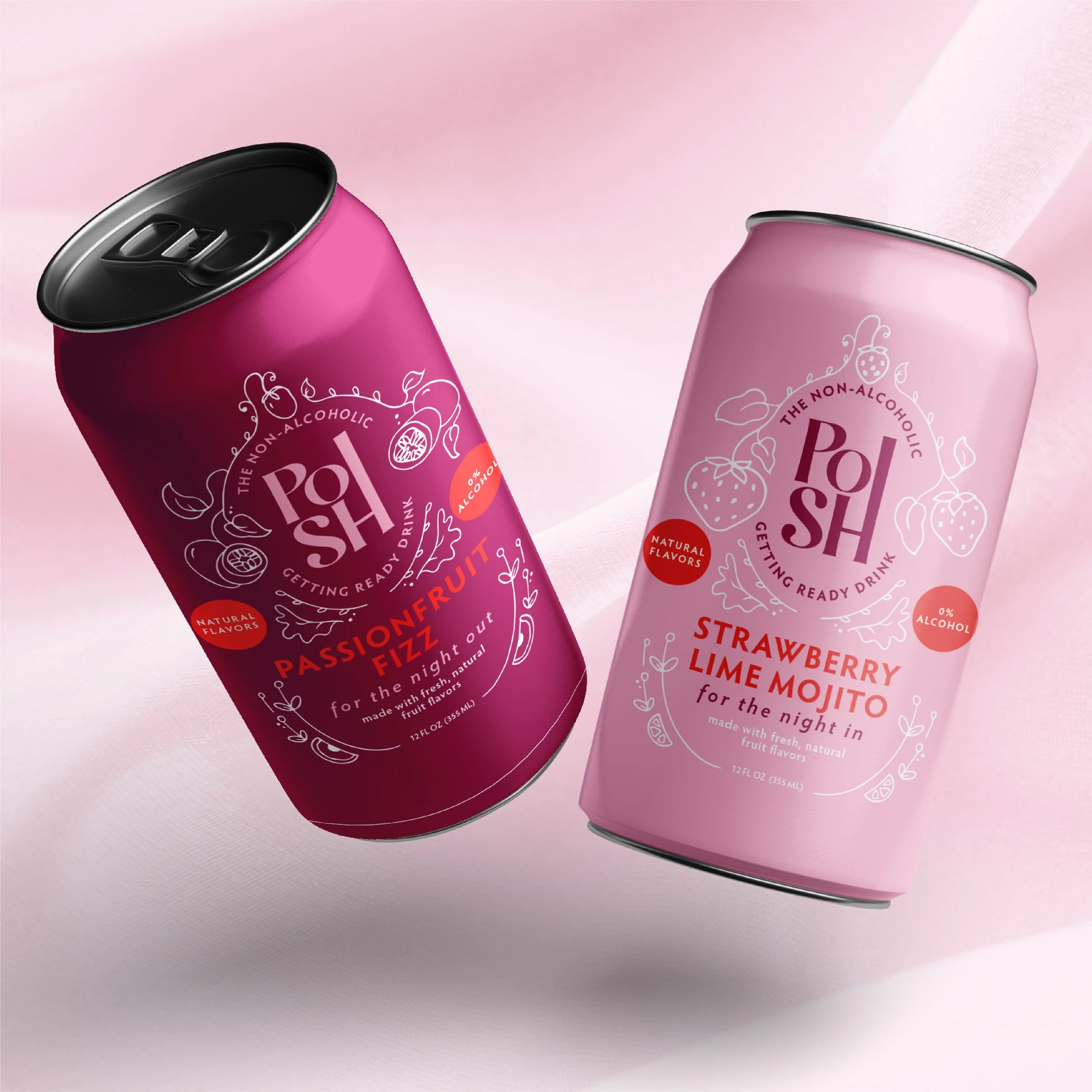
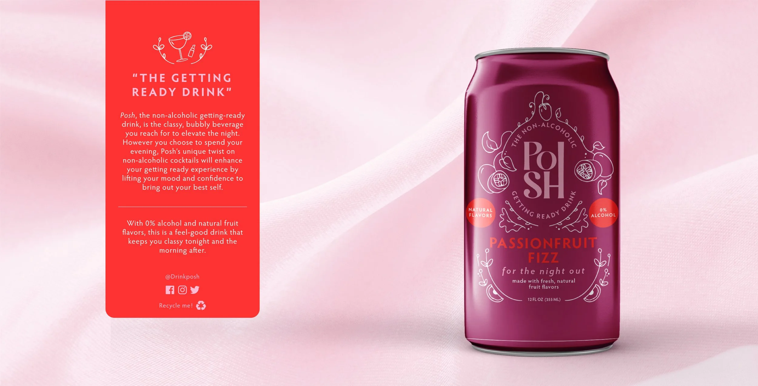
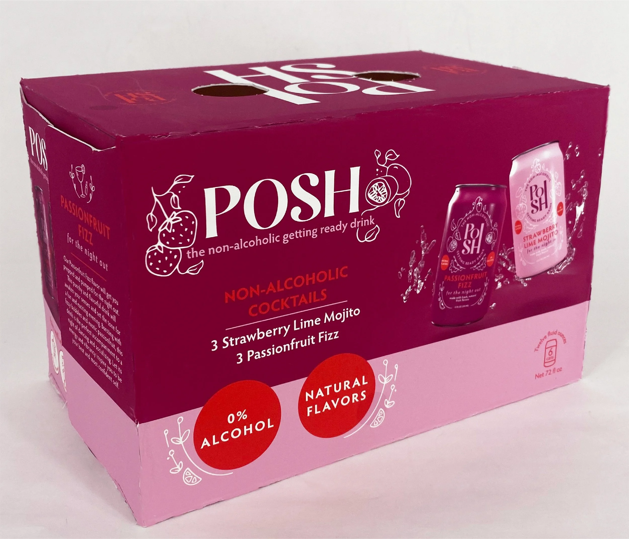
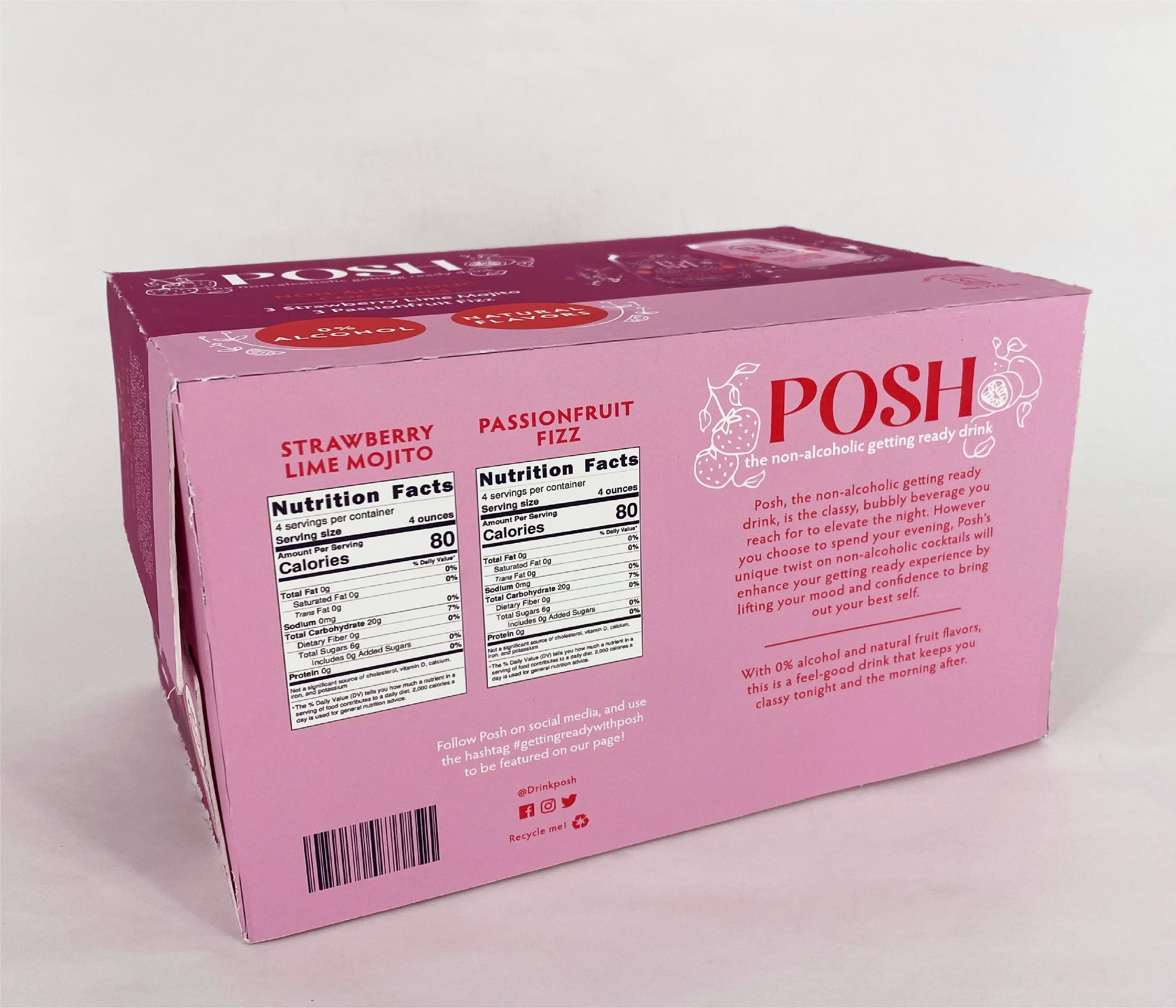
Posh is the “non-alcoholic getting-ready drink” that kicks off your night with a punch of flavor.
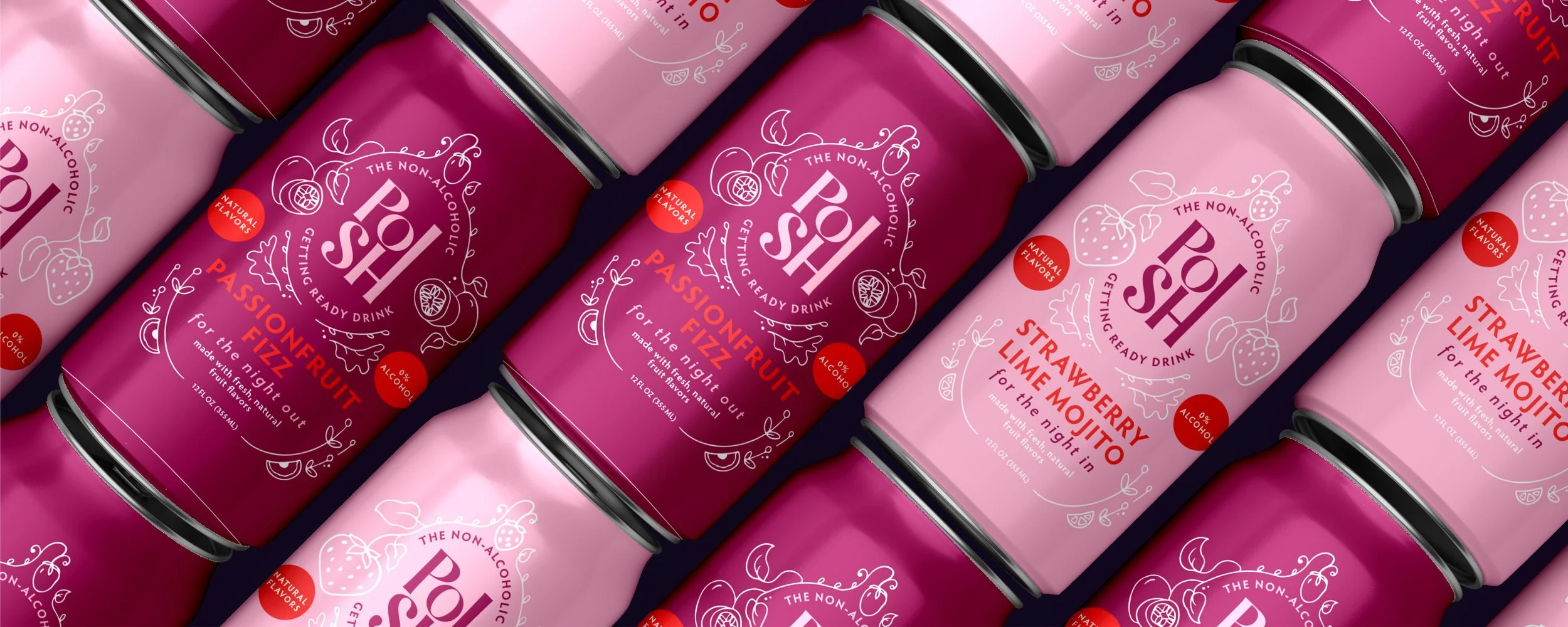
The word posh means elegant and stylishly luxurious—and these drinks embody that spirit. While the strawberry lime mojito is perfect for a relaxing night in, the passionfruit fizz gives you the touch of boldness you need for a night out on the town. Posh’s branding is fun and flirty while still remaining refined and elegant.
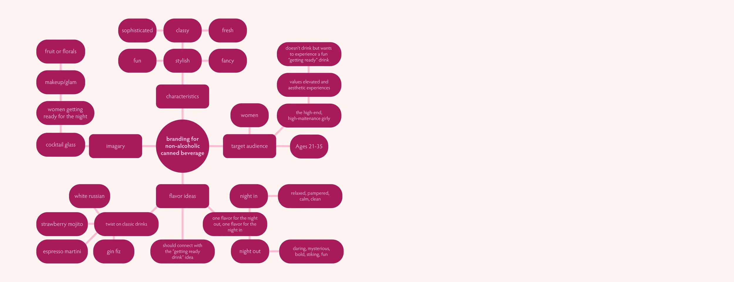
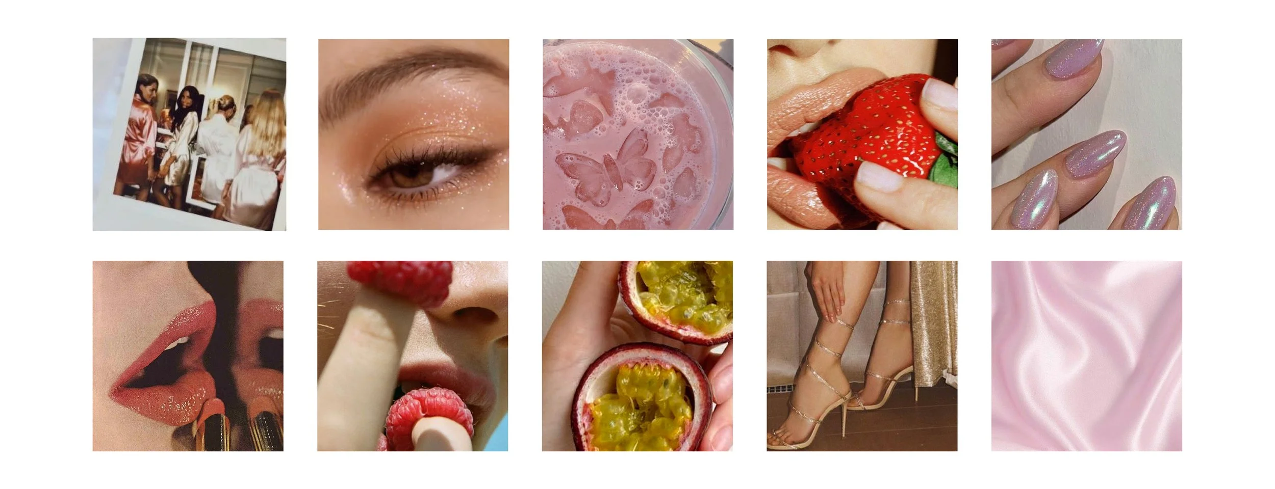
To establish a clear brand identity, I used mind maps, mood boards, and competitive analyses. I identified the target audience as women ages 21–35 who value aesthetic, curated experiences. From there, I brainstormed brand values, imagery, and flavor concepts that aligned with both the audience and the mood board. Once Posh’s identity was defined, I moved into the design phase.
The Target Audience
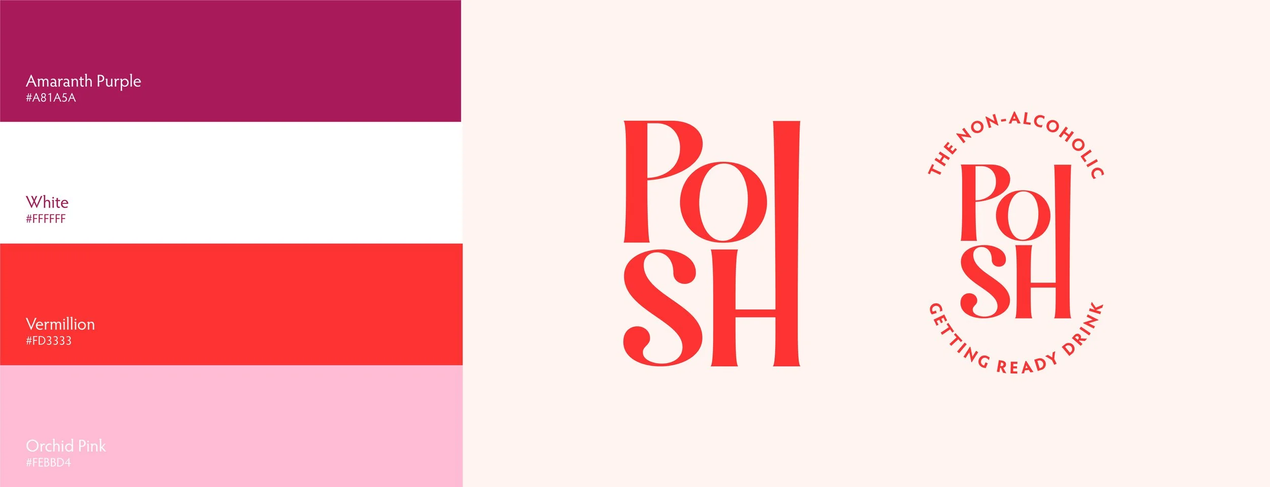
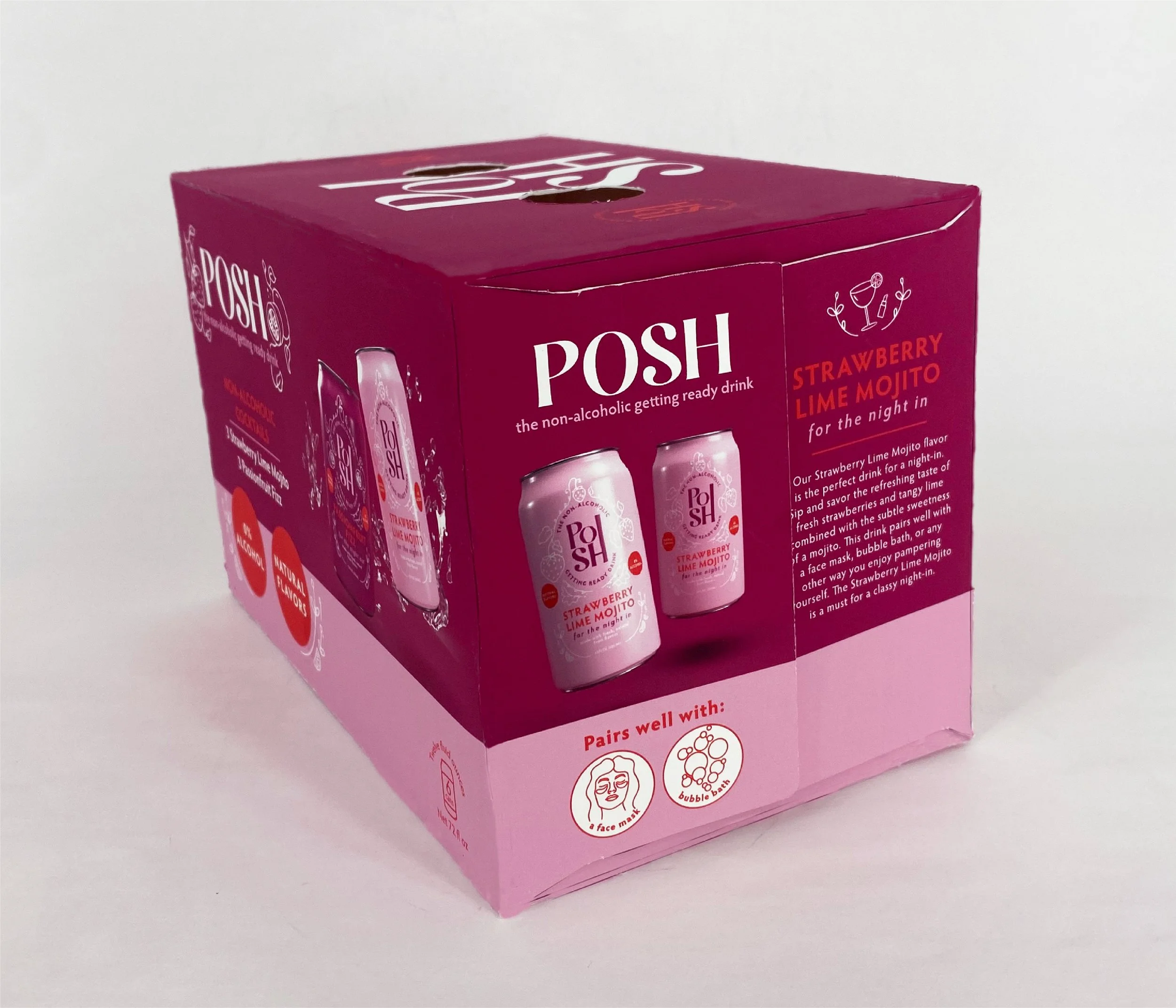
After developing a simple yet elegant logo and complementary color palette tailored to the target audience, I moved into packaging design. I incorporated hand-drawn illustrations to emphasize the brand’s witty and flirty tone, and I created two contrasting versions: one for a night in and one for a night out. I then produced physical mockups of the boxes, ensuring they were eye-catching and clearly communicated that the drinks are non-alcoholic.